
photo from csoaps.no
C SOAPS
Visual identity
Naming
Naming
Packaging design
Pitch
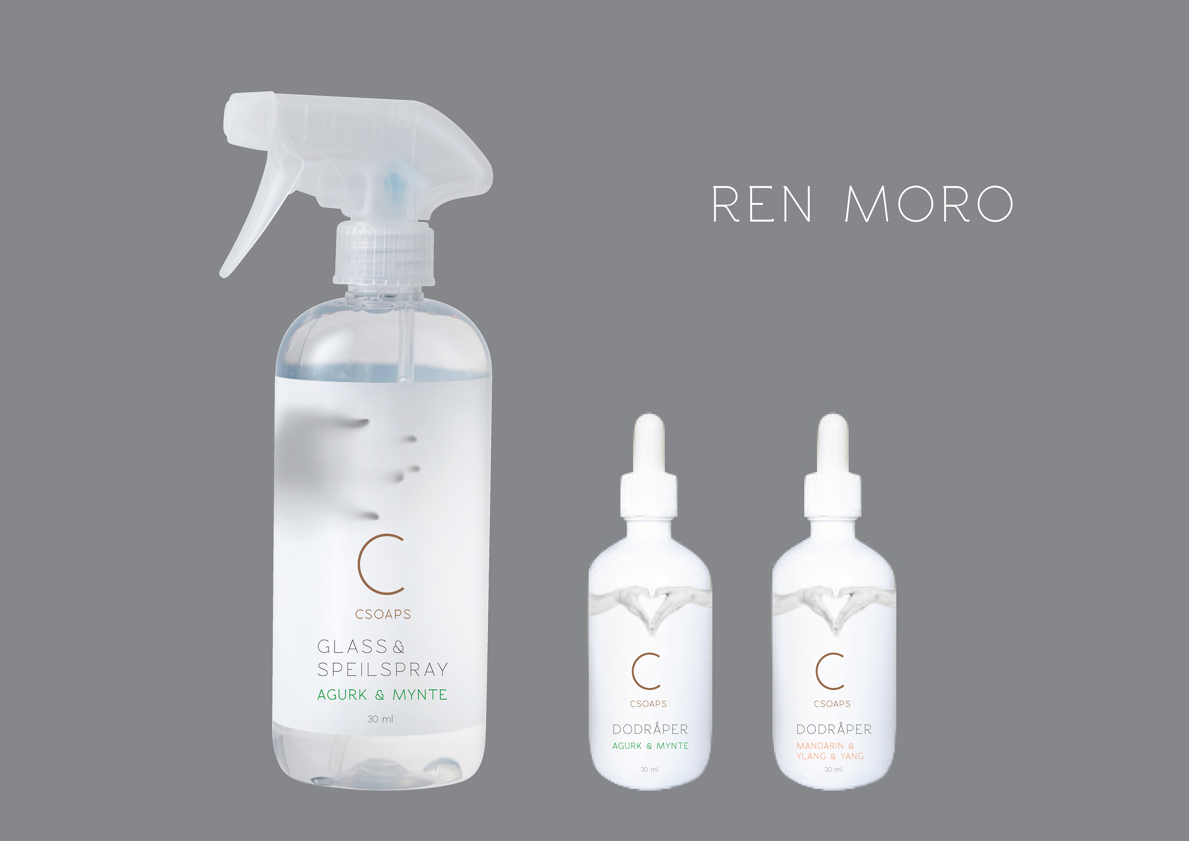
Ren moro
The Norwegian brand C soaps makes soaps and detergents for Northern Europe citizens with organic fragrances and free from chemicals.
C soaps needed help with the design of a package for the toilet product post-poo drops. They also wanted to further visually develop the brand identity. I was asked to pitch my proposal. Get C soaps to shine on the shelf. Lift the bright nordic white and clean to new heights. Neither the name of the scent nor the shape was determined.
I made a pitch for C soaps. Below you can find some of my recommendations.
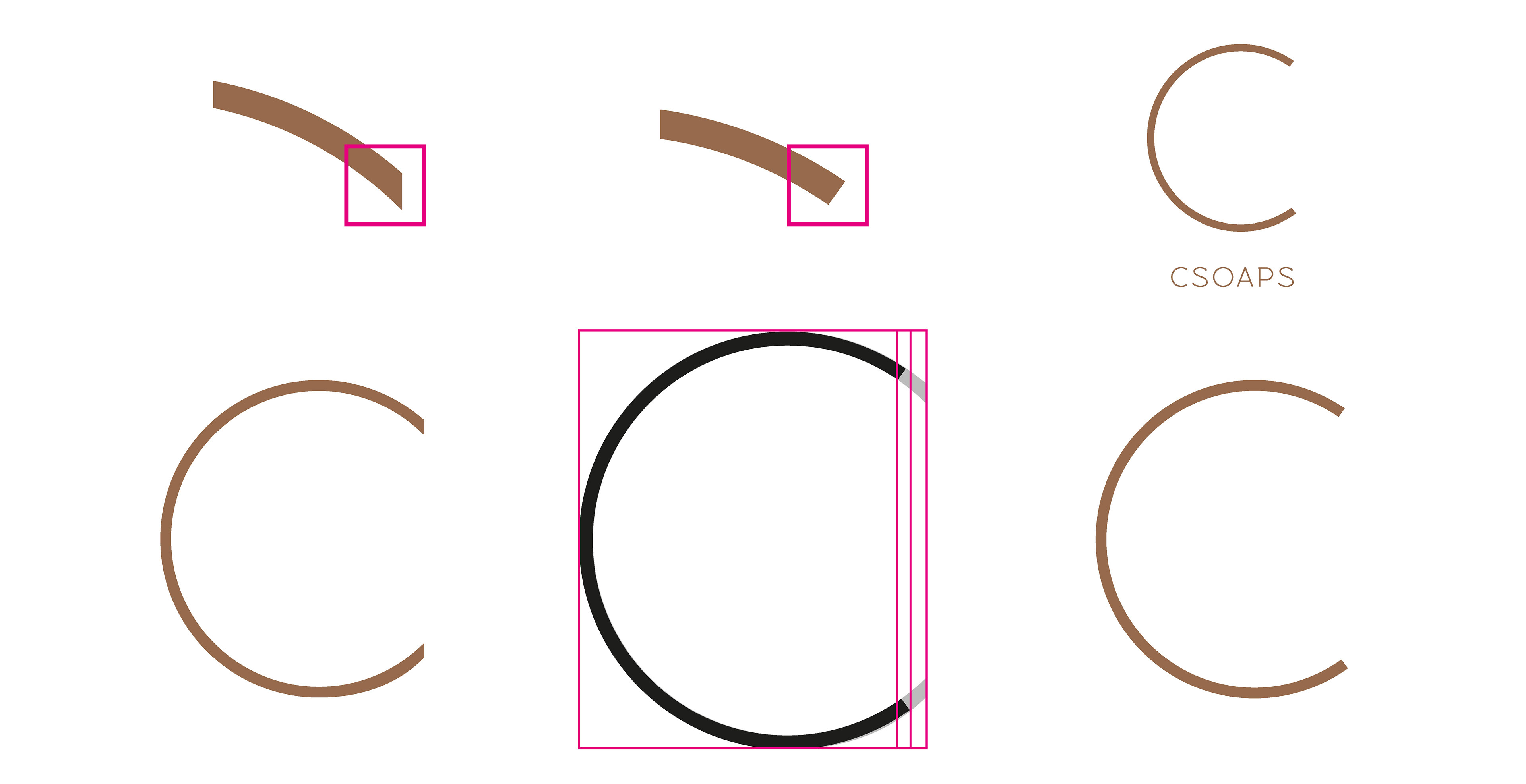
Logotype
The letter "C" represents Caroline Heyerdahl, founder of C soaps. It is made out of a circle. To avoid the C falling over I compressed it a little and cut the edges. The look became cleaner and more stable.
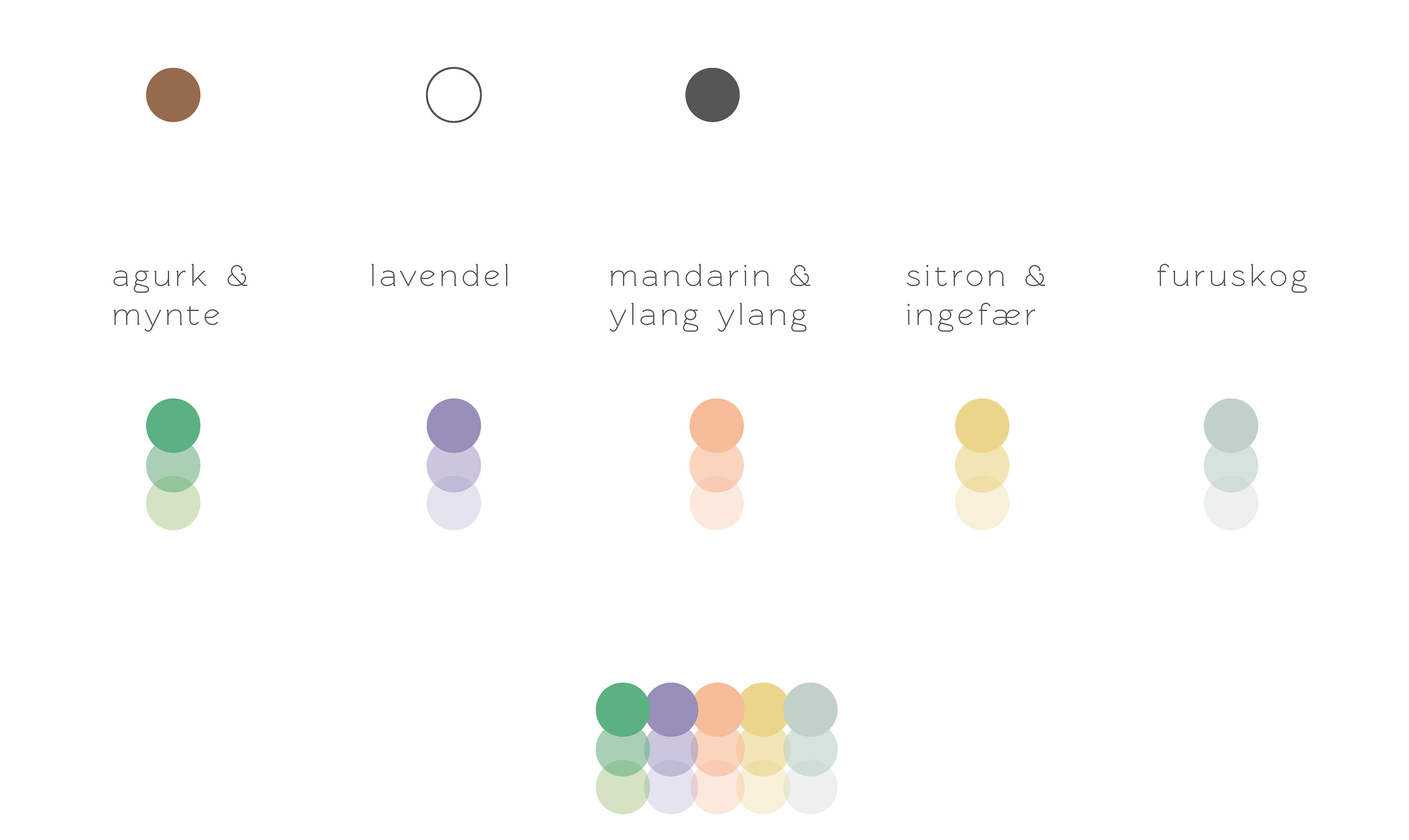
Colors
Bronze is logo color. Green, white and black and some secondary colors are used. I extended and clarified the "smell" color palette and extended it from 1 to 3 nuances each.

Icons
Icons visually explain the product even in very small sizes on the back of the bottle or in digital contexts.